Everyone is building apps with AI right now.
And almost all of them look the same. Same layouts, same generic gradients, same "made by a robot in one prompt" feel.
Users notice. They can't always explain it, but they feel it in the first 5 seconds. And they close the app.
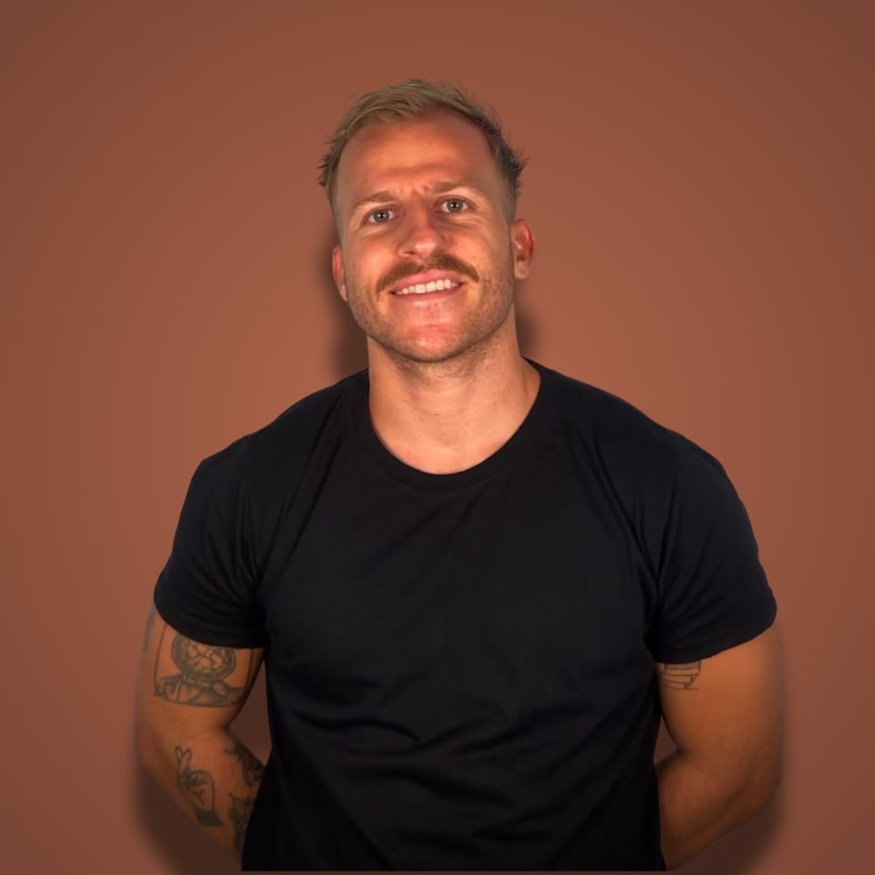
That's why this Starter Story Build episode stopped me mid-scroll. They brought in Mattia, a designer turned SaaS builder, and he designed AND built a working mobile app in about 45 minutes. Not a Figma mockup. A real app running on a phone, with custom illustrations and a mascot.
The niche he picked? Water tracking apps. The top one he found makes $50,000 a month.
Here's the full video, and below it, the exact process step by step.
Why design is suddenly the moat
Quick context on why this matters so much in 2026.
Building is no longer the hard part. Anyone can one-shot an app with Claude Code or a vibe coding tool. I wrote about Alex shipping 30 AI slop apps in 30 days: he got 70K searches of traffic and made exactly $0. Shipping fast is table stakes now.
So where do users decide to pay?
Design. Not "pretty pixels" design. The kind of design that makes an app feel like a product instead of a demo.
Mattia has spent the last 2 years building design tools. His latest one, Sleek, was built with 2 co-founders in about 2 months and already helps hundreds of people design mobile apps with AI. His whole thesis: good design doesn't mean beautiful, it means users come back every day.
Here's how he does it, start to finish.
Step 1: Steal from apps already making $50K/month
Mattia's first rule: don't reinvent the wheel.
He wanted to build a water reminder app (he genuinely forgets to drink water, his friends roast him for it). So before touching any design tool, he opened two research tabs:
→ Sensor Tower, to find water tracker apps and see their revenue. That's where he found Water Llama, doing $50K a month.
→ Mobbin, a design library of popular apps, to study every screen and flow of those winners.
Then he built a mood board from 3 apps:
→ Water Llama: clean, playful, gamified. You feed a llama mascot by drinking water.
→ Plant Nanny: the plant concept. Drink water and your plant grows. Skip a day and it dies. Built-in guilt trip.
→ A bolder third app: he hated the aggressive vibe but loved the nav bar, the slider, and the big numbers.
For each one he wrote down exactly what he liked and what he didn't.
That's the whole trick. You're not copying one app (that's a copycat). You're combining the best pieces of 3 proven apps into your own twist.
Total time: maybe 10 minutes. And now every design decision downstream is backed by apps that already print money.
Step 2: Turn the mood board into a requirements doc (with Gemini)
Most people skip this step and prompt their design tool with "make me a water tracking app". Then they wonder why it looks generic.
Mattia does the opposite. He feeds Gemini the actual screenshots from his mood board and tells it what each one is for:
→ Water Llama screenshots for the overall vibe.
→ The plant concept from Plant Nanny for gamification.
→ The bold app's screenshots for specific UI elements.
Gemini turns that into a detailed requirements document. Colors, components, layout, the mascot concept, everything.
The lesson here is bigger than design: the quality of AI output is mostly decided before you hit enter. Screenshots plus specifics beat vague prompts every time.
Step 3: Generate the design, 3 times in parallel
He pasted the full requirements doc into Sleek (his own tool, and he was upfront in the video that it's not a sponsored pick, you could grind through Figma tutorials instead).
Then he did something I'm stealing: he ran the same prompt 2 to 3 times in parallel.
AI has randomness built in. Same prompt, different results. Running it multiple times gives you options, and picking the best of 3 beats accepting the first output. He does the same thing later with Claude Code, and honestly it works for idea generation in ChatGPT too. Three tabs, same prompt, pick the winner.
A design principle he dropped while refining the screens: keep every action in the lower part of the screen. The "add water" button is the main thing users tap, so it should sit where thumbs live, not at the top corner.
Small detail. The kind users never consciously notice, and always feel.
Step 4: The mascot (this is what separates real apps from slop)
A bottle of water filling up is boring.
A thirsty little mascot you keep alive by drinking water? That's an app people open every day.
Starter Story mentioned they once interviewed a founder whose app mascot made over a million dollars. Attachment is a retention feature.
Mattia's illustration workflow:
→ Grab 2 to 3 mascot references from Mobbin in the style you want.
→ Ask Gemini to analyze them and describe exactly what makes the style work.
→ Take that description to ChatGPT (at the time of the video, the one that reliably does transparent-background PNGs) and generate your own mascot with it.
→ Quick crop in Figma so the file causes fewer problems in code.
→ Upload it straight into the design.
Custom illustrations used to mean hiring an illustrator. Now it's a 10-minute loop between two AI tools.
Step 5: One-shot the working app with Claude Code
Design done. Now the part that used to take a dev team weeks.
Sleek exports the design as HTML code with a build prompt. Mattia pasted the whole thing into Claude Code inside Cursor, on a starter repository that's pre-configured for React Native so there's no setup pain.
Two power moves worth noting:
→ He added "ultra think" to the prompt, which pushes Claude Code to reason longer before writing code.
→ He ran the build twice in parallel ("I have Claude Code Max, so I need to enjoy it"). Same logic as the designs: two attempts, keep the better one.
The result, from one prompt: a working water tracker. Fonts working, icons working, the slider working, and even the math logic (add 250ml, the daily total updates correctly).
One bug: the plant illustration didn't load. The fix was telling Claude Code "grab the image from my downloads folder". Done.
Total session: 30 to 45 minutes. Research to working prototype, in a niche where the leader makes $50K a month.
If you want to see how fast the pure build side has gotten, Max from the same channel built an app in 17 minutes and his portfolio does $36K a month. The difference in this episode is the design layer on top. That's the part most builders skip, and it's exactly why their apps die in the App Store.
What I'd actually take from this
Not "AI can build apps now". You knew that.
The real playbook:
→ Research revenue before pixels. 10 minutes on Sensor Tower tells you if the niche pays.
→ Mood board from 3 winners, then combine. Never design from a blank page.
→ Feed AI screenshots and specifics, not adjectives.
→ Run every important prompt 2 to 3 times in parallel and pick the best.
→ Invest in a mascot or custom illustrations. A character people care about is what gets the app opened daily.
→ Do the design pass before you ship the prototype. It's an extra hour that changes how users judge you in the first 5 seconds.
And Mattia's next move after the video? Not more features. The onboarding flow. Same method: study what works, apply it, test it.
FAQ
Can you really design an app with AI in under an hour?
Yes, for a first version. In the video, Mattia went from idea to a working, designed prototype in about 45 minutes: research on Sensor Tower and Mobbin, a requirements doc in Gemini, design generation in Sleek, a custom mascot via ChatGPT, and a working React Native build from one Claude Code prompt. A polished App Store release (onboarding, paywall, edge cases) still takes longer.
What tools do you need to design an app with AI?
Mattia's stack in the video: Sensor Tower for revenue research, Mobbin for design references, Gemini for the requirements doc and style analysis, Sleek for AI design generation, ChatGPT for transparent-background mascot PNGs, Figma for a quick crop, and Claude Code (in Cursor) to turn the design into a working app. Swap in equivalents if you have them; the process matters more than the exact tools.
Do I still need to hire a designer for my app?
For a first version to validate, no. The mood board method (combine what works from 3 profitable apps) plus AI design tools gets you past "AI slop" quality on your own. Where designers still earn their fee: brand systems, complex products, and the onboarding flows that decide whether a downloaded app becomes a paying user.
Why do design and mascots matter if the app works?
Because working isn't the bar anymore, everyone's app works. Design is what users judge in the first seconds, and a mascot they care about is what brings them back. Feed the llama, keep the plant alive: it turns a chore into a habit. Starter Story interviewed a founder whose mascot-driven app made over $1M.
Steal playbooks like this every week
I interview bootstrapped founders doing $100K to $10M a year on the Profitable Founder Podcast, and I break down exactly how they got there. Real numbers, real playbooks, no fluff.